Logo Submark Brand Guide Web Design Business Card Letterhead Socials Deck
Description:
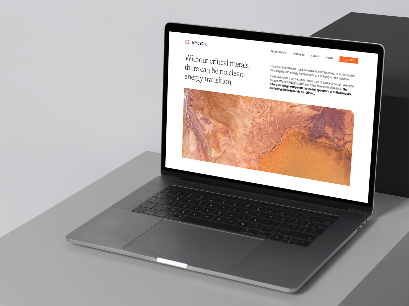
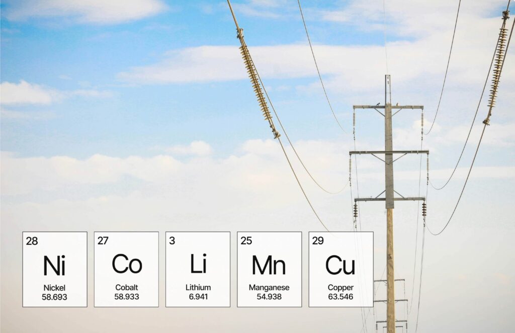
Nth Cycle is an inspiring climate company that refines critical metals. They use clean electro-extraction technology to recover critical minerals from e-waste, transforming them into production-grade feedstocks for the clean energy transition.
The logo is created from a bar representing a plate and two triangular arrows pointing in opposite directions, relating to the electro-extraction process. It also subtly creates an N in its negative space and hints at a battery on the right side as well. The Nth Cycle palette consists of three bold eye-catching colors along with a grounding dark near black and a pale neutral grey. The orange represents the energy aspect of the brand, the red signifies passion, and the yellow (or gold) alludes to the preciousness of the materials. Beautiful satellite images of the earth paired with clean typographic hierarchy help set the stage for the editorial feel. Generous amounts of white are used so as not to overtax the viewers’ eyes.