

Client:
Better
Role:
Designer
Illustrator
Developer
Deliverables:
Logo
Submark
Brand Guide
Website
Illustrations
Description:
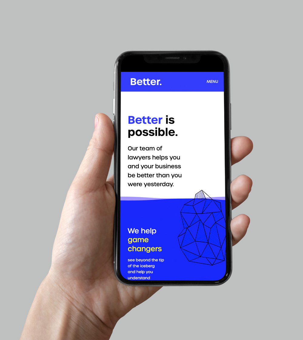
Better is a team of lawyers who specialize in trademark, business formation & securities and contracts.
The logo is created with a modified version of the typeface Urbane Semi-bold. The typography is clean and modern, with the “t”s touching to represent “better together”.
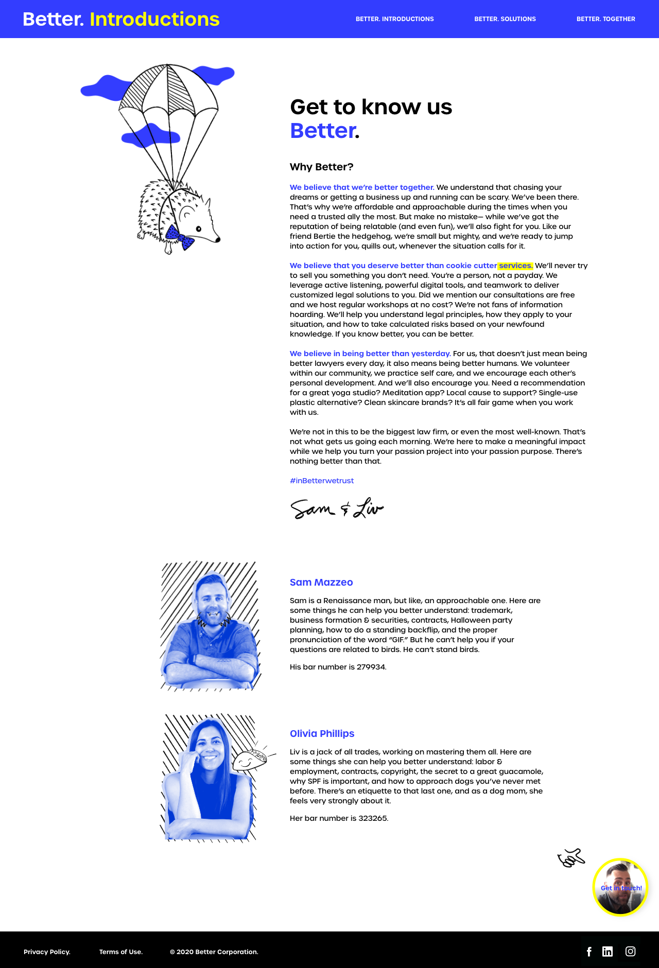
The brand has a number of custom illustrations with a loose sketchy style. These express the “tastefully irreverent” side of the brand’s personality. They are interspersed throughout web and print materials to add a lightness to the legal side of things.
Agency:
Four Fin Creative
