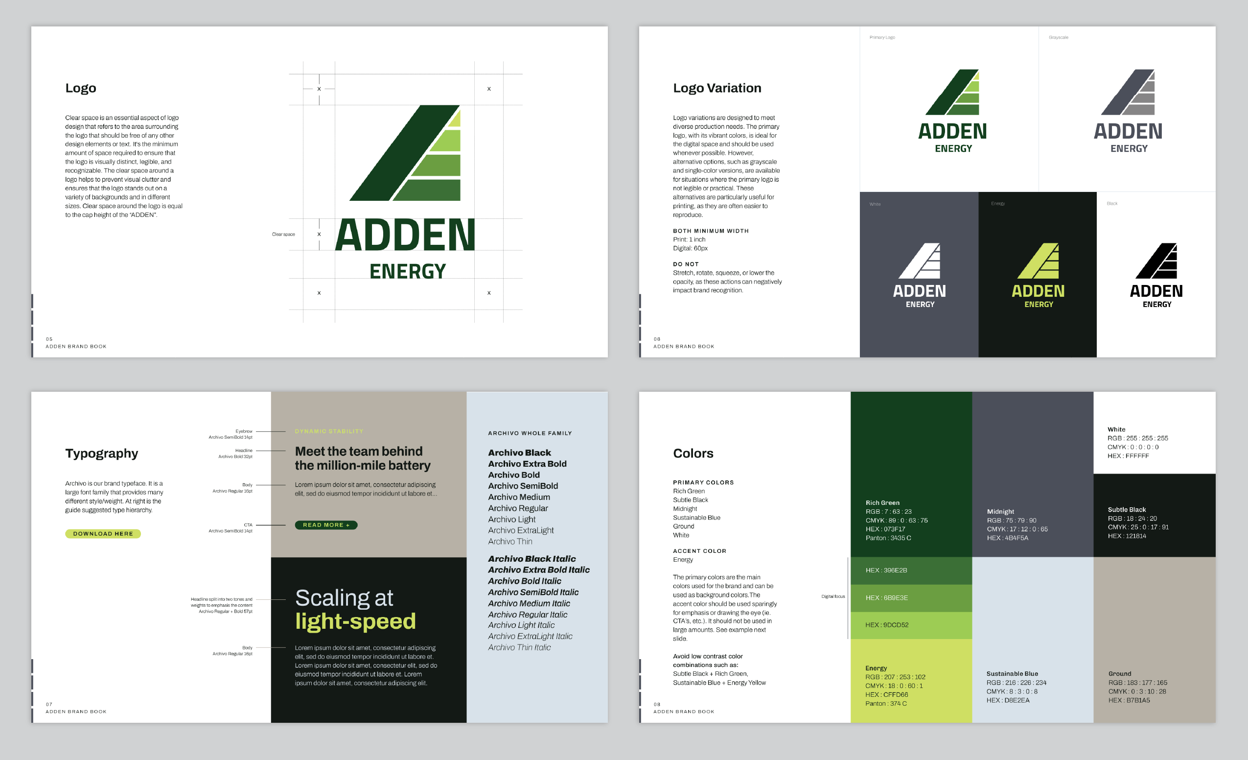
Logo Submark Brand Guide Web Design Business Card Letterhead Deck
Description:
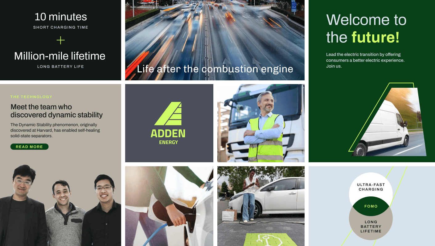
Adden Energy created a dynamically-stable battery that will make EVs accessible to everyone. Not only does it charge in the time it would take to fill a gas tank, it also has a million-mile lifetime. This is a game changer for trucks used for shipping.
The logo is vaguely reminiscent of the charging bars of a battery. It also subtly creates an A and hints at a road on the left as well. The Adden palette consists of various greens and a sky blue along with a grounding dark near black and an earthy neutral tan. The neon green represents the energy aspect of the brand, while the blue signifies optimism and a blue-sky approach. Dynamic forward leaning lines and bars paired with clean typographic hierarchy combine to suggest the momentum of the brand. A charcoal grey adds depth and seriousness.